はじめに
Shopifyのテーマカスタマイズの使いやすさは特筆すべきものだと感じます。
より楽しく開発ができるよう、セクションやブロック設定で使用できるschemaのtypeを、自分なりに分類してまとめました。
基本のプロパティ
| プロパティ | 説明 |
|---|---|
| type | 設定の種類 (※必須) |
| id | 一意のユニークな値 (※必須) |
| label | 管理画面に表示される設定の名前 (※表示系以外では必須) |
| default | 設定のデフォルト値 |
| info | 管理画面に表示される設定の説明文 |
補足:カスタマイズ画面で項目名を動的に反映させるには?
idプロパティの値に title と指定すると、カスタマイズ画面で入力したテキストが項目名に反映されます。

カスタマイズ画面
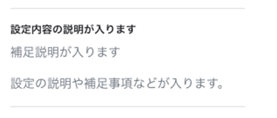
header – 見出し
カスタマイズ画面にヘッダーを追加します。
{
  "type": "header", //必須
  "content": "設定内容の説明が入ります", //必須
  "info": "補足説明が入ります"
}
paragraph – 段落
headerとは別に文章を設置できます。
{
  "type": "paragraph", //必須
  "content": "設定の説明や補足事項などが入ります。"
}
テキスト系
text – テキスト
1行テキストを設定します。
| オプションプロパティ | 説明 |
|---|---|
| placeholder | プレースホルダー値が設定できます。 ※settings_schema.json での定義が必要。 |
{
 "type": "text", //必須
 "id": "id_text", //必須
 "label": "テキストの入力欄です", //必須
 "default": "デフォルトのテキスト",
 "info": "説明文です",
 "placeholder": {
    "ja": "タイトル",
    "en": "Title",
    "de": "Titel",
    "es": "Título",
    "fr": "Titre"
  }
}
<!-- ◎出力例 -->
{{ block.settings.id_text }}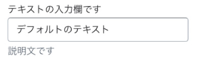
inline_richtext – インラインリッチテキスト
書式設定のある1行テキストを設定します。
メモ
改行不可
{
  "type": "inline_richtext", //必須
  "id": "id_inline_richtext", //必須
  "label": "テキストの入力欄です", //必須
  "default": "デフォルトのテキスト",
  "info": "説明文です"
}
<!-- ◎出力例 -->
{{ block.settings.id_inline_richtext }}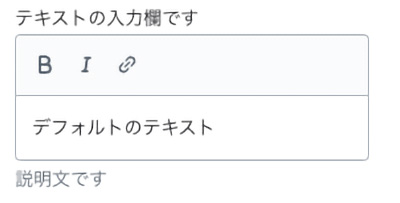
richtext – テキストエリア
書式設定のあるテキストエリアを設定します。
メモ
・pタグ もしくは ulタグ が最上位要素になる必要があります。
・改行可能。
| オプションプロパティ | 説明 |
|---|---|
| placeholder | プレースホルダー値が設定できます。 ※settings_schema.json での定義が必要。 |
{
  "type": "richtext", //必須
  "id": "id_richtext", //必須
  "label": "リッチテキストの入力欄です", //必須
  "default": "<p>デフォルトのテキスト</p>",
  "info": "説明文です",
  "placeholder": "t:sections.sample.blocks.richtext.settings.id_richtext.placeholder"
}
<!-- ◎出力例 -->
{{ block.settings.id_richtext }}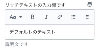
選択系
checkbox – チェックボックス
真偽値を返すチェックボックスを設定します。
{
  "type": "checkbox", //必須
  "id": "id_checkbox", //必須
  "label": "チェックボックスです", //必須
  "default": true, //指定しない場合のデフォルトは false
  "info": "説明文です"
}
<!-- ◎出力例 -->
{% if section.settings.id_checkbox == false %}class{% endif %}
radio – ラジオボタン
ラジオボタンを使用して一意のvalueの値を返します。
メモ
default を指定しない場合は最初のオプションがデフォルト値になります。
{
  "type": "radio", //必須
  "id": "id_radio", //必須
  "label": "ラジオボタンです", //必須
  "info": "説明文です",
  "options": [ //必須
    {
      "value": "left",
      "label": "左"
    },
    {
      "value": "center",
      "label": "中央"
    },
    {
      "value": "right",
      "label": "右"
    }
  ],
  "default": "left"
},
<!-- ◎出力例 -->
<div class="align-{{ section.settings.id_radio }}"></div>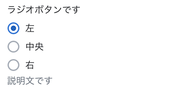
range – レンジスライダー
範囲を限定したレンジスライダーを設定します。
メモ
・default が必須項目になります。
・default には min max の値を指定できません。
| プロパティ | 説明 |
|---|---|
| min | 最小値 (※必須) |
| max | 最大値 (※必須) |
| step | ステップ数 (※必須) |
| unit | 管理画面に表示させる単位 |
{
  "type": "range", //必須
  "id": "id_range", //必須
  "min": 8, //必須
  "max": 24, //必須
  "step": 4, //必須
  "default": 16, //必須
  "unit": "個",
  "label": "レンジスライダーです", //必須
  "info": "説明文です"
}
<!-- ◎出力例 -->
<div class="grid--{{ section.settings.id_range }}-col-desktop"></div>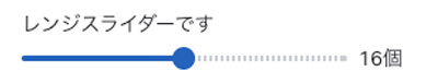
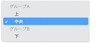
select – セレクトボックス
セレクターを設定します。
メモ
default を指定しない場合は最初のオプションがデフォルト値になります。
| プロパティ | 説明 |
|---|---|
| options | 選択項目 (※必須) |
| group | 選択項目をグループ化して表示させます |
{
  "type": "select", //必須
  "id": "id_select", //必須
  "label": "セレクターです", //必須
  "info": "説明文です",
  "options": [ //必須
    {
      "group": "グループA",
      "value": "top",
      "label": "上"
    },
    {
      "group": "グループA",
      "value": "middle",
      "label": "中央"
    },
    {
      "group": "グループB",
      "value": "bottom",
      "label": "下"
    }
  ],
  "default": "middle"
}
<!-- ◎出力例 -->
<div class="margin-{{ section.settings.id_select }}"></div>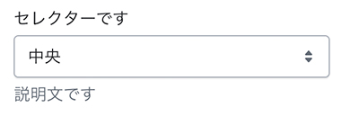
数値系
number – 数値入力
数値入力を設定します。
{
  "type": "number", //必須
  "id": "id_number", //必須
  "label": "数値入力です", //必須
  "default": 20,
  "info": "説明文です"
}
<!-- ◎出力例 -->
{{ section.settings.id_number }}px;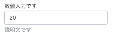
ウィジェット系
article – ブログ記事単体
ブログ記事を1つ出力します。
{
  "type": "article", //必須
  "id": "id_article", //必須
  "label": "記事を選択", //必須
  "info": "説明文です"
}
<!-- ◎出力例 -->
<a href="{{ section.settings.id_article.url }}">{{ section.settings.id_article }}</a>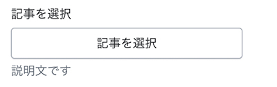
blog – ブログ情報
ブログを選択します。
{
  "type": "blog", //必須
  "id": "id_blog", //必須
  "label": "ブログを選択", //必須
  "info": "説明文です"
}
<!-- ◎出力例 -->
<a href="{{ section.settings.id_blog.url }}">{{ section.settings.id_blog }}</a>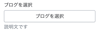
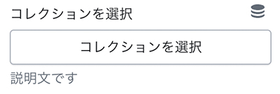
collection – コレクション情報
コレクションを選択します。
メモ
表示させる商品は1ページあたり50個の制限あり。
{
  "type": "collection", //必須
  "id": "id_collection", //必須
  "label": "コレクションを選択", //必須
  "info": "説明文です"
}
<!-- ◎出力例 -->
{% render 'card-collection',
card_collection: block.settings.id_collection
%}
collection_list – コレクションリスト
コレクションリストを出力します。
選択したコレクションは配列で返されます。
| プロパティ | 説明 |
|---|---|
| limit | 設定できるコレクションの最大数(上限:50) |
{
  "type": "collection_list", //必須
  "id": "id_collection_list", //必須
  "label": "コレクションリストを選択", //必須
  "limit": 8,
  "info": "説明文です"
}
<!-- ◎出力例 -->
{% for collection in block.settings.id_collection_list %}
{{ collection.title }}
{% endfor %}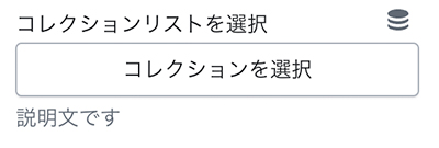
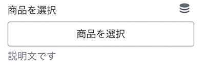
product – 商品情報
商品を選択します。
{
  "type": "product", //必須
  "id": "id_product", //必須
  "label": "商品を選択", //必須
  "info": "説明文です"
}
<!-- ◎出力例 -->
{%
render 'card-product',
card_product: block.settings.id_product
%}
page – (固定)ページ
ページを選択します。
{
"type": "page", //必須
"id": "id_page", //必須
"label": "ページを選択", //必須
"info": "説明文です"
}
<!-- ◎出力例 -->
<a href="{{ block.settings.id_page.url }}">{{ block.settings.id_page.title }}</a>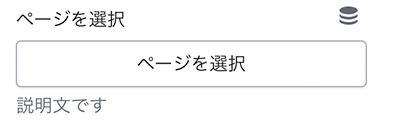
link_list – メニュー
メニューを選択
{
"type": "link_list", //必須
"id": "id_link_list", //必須
"default": "main-menu",
"label": "メニューを選択", //必須
"info": "説明文です"
}
<!-- ◎出力例 -->
{%- if block.settings.id_link_list != blank -%}
<ul>
{%- for link in block.settings.id_link_list.links -%}
<li><a href="{{ link.url }}">{{ link.title }}</a></li>
{%- endfor -%}
</ul>
{%- endif -%}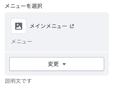
カラー系
color – カラー
カラー選択です
{
  "type": "color", //必須
  "id": "id_color", //必須
  "label": "テキストカラー", //必須
  "default": "#000000",
  "info": "説明文です"
}
<!-- ◎出力例 -->
color: {{ settings.id_color }};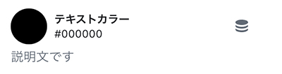
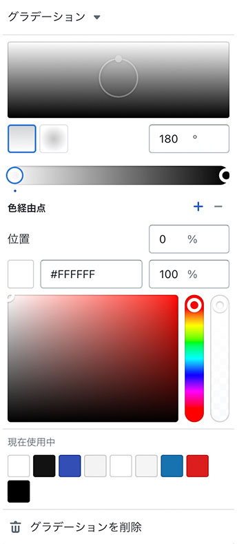
color_background – カラー(グラデーション含)
背景色
{
  "type": "color_background", //必須
  "id": "id_color_background", //必須
  "label": "背景色", //必須
  "default": "linear-gradient(#ffffff, #000000)",
  "info": "説明文です"
}
<!-- ◎出力例 -->
background: {{ settings.id_color_background }};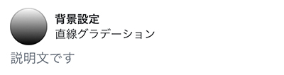
color_scheme – カラースキーマ
「テーマ設定」で設定したカラーパターンを選択します。
{
  "type": "color_scheme", //必須
  "id": "id_color_scheme", //必須
  "label": "Color Scheme", //必須
  "default": "scheme_1"
}
<!-- ◎出力例 -->
<div class="color-{{ section.settings.color_scheme }}">
参考:Shopify Dev – Input settings “color_scheme”
https://shopify.dev/docs/themes/architecture/settings/input-settings#color_scheme
color_scheme_group – カラースキーマグループ
color_scheme に使用するパターンを定義します。
メモ
config / settings_schema.json で使用します。
{
    "name": "t:settings_schema.colors.name",
    "settings": [
      {
        "type": "color_scheme_group",
        "id": "color_schemes",
        "definition": [
          {
            "type": "color",
            "id": "background",
            "label": "t:settings_schema.colors.settings.background.label",
            "default": "#FFFFFF"
          },
          {
            "type": "color_background",
            "id": "background_gradient",
            "label": "t:settings_schema.colors.settings.background_gradient.label",
            "info": "t:settings_schema.colors.settings.background_gradient.info"
          },
          {
            "type": "color",
            "id": "text",
            "label": "t:settings_schema.colors.settings.text.label",
            "default": "#121212"
          },
          {
            "type": "color",
            "id": "button",
            "label": "t:settings_schema.colors.settings.button_background.label",
            "default": "#121212"
          },
          {
            "type": "color",
            "id": "button_label",
            "label": "t:settings_schema.colors.settings.button_label.label",
            "default": "#FFFFFF"
          },
          {
            "type": "color",
            "id": "secondary_button_label",
            "label": "t:settings_schema.colors.settings.secondary_button_label.label",
            "default": "#121212"
          },
          {
            "type": "color",
            "id": "shadow",
            "label": "t:settings_schema.colors.settings.shadow.label",
            "default": "#121212"
          }
        ],
        "role": {
          "text": "text",
          "background": {
            "solid": "background",
            "gradient": "background_gradient"
          },
          "links": "secondary_button_label",
          "icons": "text",
          "primary_button": "button",
          "on_primary_button": "button_label",
          "primary_button_border": "button",
          "secondary_button": "background",
          "on_secondary_button": "secondary_button_label",
          "secondary_button_border": "secondary_button_label"
        }
      }
    ]
  }
参考:Shopify Dev – Input settings “color_scheme_group”
https://shopify.dev/docs/themes/architecture/settings/input-settings#color_scheme_group
デザイン系
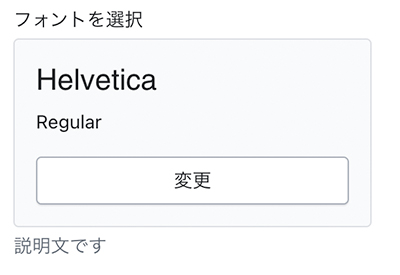
font_picker – フォント
フォントを選択します。
メモ
・default が必須項目になります。
・Shopifyフォントライブラリを利用。
{
  "type": "font_picker", //必須
  "id": "id_font_picker", //必須
  "label": "フォントを選択", //必須
  "default": "helvetica_n4", //必須
  "info": "説明文です"
}
<!-- ◎出力例 -->
:root{
--font-heading-family: {{ settings.id_font_picker.family }}, {{ settings.id_font_picker.fallback_families }};
}
【参考】
【Shopify】liquidのオブジェクトについてまとめてみた (font, forloop, form)
https://qiita.com/eijiSaito/items/c88a882fb8823706d70d
メディア系
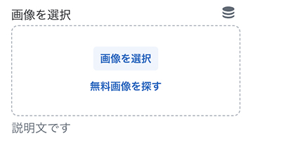
image_picker – 画像
画像を選択します。
{
  "type": "image_picker", //必須
  "id": "id_image", //必須
  "label": "画像を選択", //必須
  "info": "説明文です"
}
<!-- ◎出力例 -->
{{
section.settings.id_image
| image_url: width: 3840
| image_tag:
loading: 'lazy'
}}
【参考】Shopify Dev – image_tag
https://shopify.dev/docs/api/liquid/filters/image_tag
video – 動画
動画を選択します。
{
  "type": "video", //必須
  "id": "id_video", //必須
  "label": "動画を選択", //必須
  "info": "説明文です"
}
<!-- ◎出力例 -->
{%- liquid
assign video_id = section.settings.video.id | default: section.settings.video_url.id
-%}
<deferred-media data-media-id="{{ video_id }}">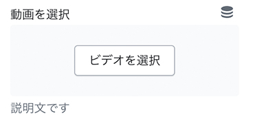
video_url – 動画URL
動画のURLを指定します。
{
  "type": "video_url", //必須
  "id": "id_video_url", //必須
  "label": "動画のURLを入力", //必須
  "default": "https://www.youtube.com/watch?v=_9VUPq3SxOc",//デフォルト値の指定が可能です。
  "info": "説明文です",
  "accept": [
    "youtube",
    "vimeo"
  ]
}
<!-- ◎出力例 -->
ID: {{ settings.id_video_url.id }}
Type: {{ settings.id_video_url.type }}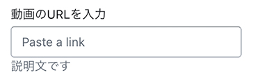
自由入力系
url – URL・リンク
URLを入力します。
{
  "type": "url", //必須
  "id": "id_url", //必須
  "label": "URLを入力", //必須
  "info": "説明文です"
}
<!-- ◎出力例 -->
{{ block.settings.id_url }}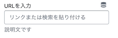
html – HTMLエディタ
HTMLを自由に入力できます。
メモ
タグがある場合は自動的に削除されます。
{
  "type": "html", //必須
  "id": "id_html", //必須
  "label": "HTMLを入力", //必須
  "info": "説明文です"
}
<!-- ◎出力例 -->
{{ section.settings.id_html }}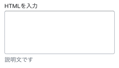
liquid – Liquidエディタ
Liquidを自由に入力できます。
{
  "type": "liquid", //必須
  "id": "id_liquid", //必須
  "label": "カスタマイズされたLiquid", //必須
  "default": "{% if product %}sample{% endif %}",
  "info": "アプリのスニペットやその他のLiquidコードを追加して、高度なカスタマイズを作成します。"
}
<!-- ◎出力例 -->
{{ section.settings.id_liquid }}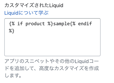
【参考】
Shopify Dev – Sidebar settings
https://shopify.dev/docs/themes/architecture/settings/sidebar-settings
Shopify Dev – Input settings
https://shopify.dev/docs/themes/architecture/settings/input-settings
Shopify Dev – API liquid objects
https://shopify.dev/docs/api/liquid/objects